Chat cards
To present information in the Alan AI Agentic Interface in a structured and visually appealing way, you can display Agentic Interface messages as cards.
A card is a container that can hold text, images, icons and other information. Cards are designed to present data in a simple and focused manner, making it easier for users to scan and comprehend the content.
You can use cards to showcase a variety of content, including:
Greeting messages
Recommendations or suggestions
Product details
Content summary and more
Card display options
To display cards in the Agentic Interface UI, you can:
Add Markdown formatted text to the
p.play()functionUse the
showPopup()function in the script
You can display a card as Markdown formatted text in the p.play() function. To do this:
Format the card text using Markdown. For details, see Markdown Basic Syntax.
In the
p.play()function, enable themarkdownoption:opts({markdown: true}). For details, see Play options.
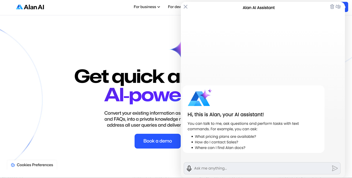
In the example below, the Agentic Interface displays a greeting to the user when a new dialog session starts:
onCreateUser(p => {
    const greetingImage = "https://storage.googleapis.com/alan-public-images/alan-webflow-website/alan-chat-logo.svg";
    const greetingTitle = "Hi, this is Alan, your Agentic Interface!";
    const greetingText = "You can talk to me, ask questions and perform tasks with text commands. For example, you can ask: \n - What pricing plans are available? \n - How do I contact Sales? \n - Where can I find Alan docs?";
    const img = `<img style="display: block;margin-bottom: 20px; height:75px" src="${greetingImage}"/>`;
    const title = `<div style="margin-bottom: 10px;font-weight: 700;font-size: 20px;">${greetingTitle}</div>`;
    p.play(`${img}${title}${greetingText}`, opts({ force: true, markdown: true, audio: false, greeting: true}));
});
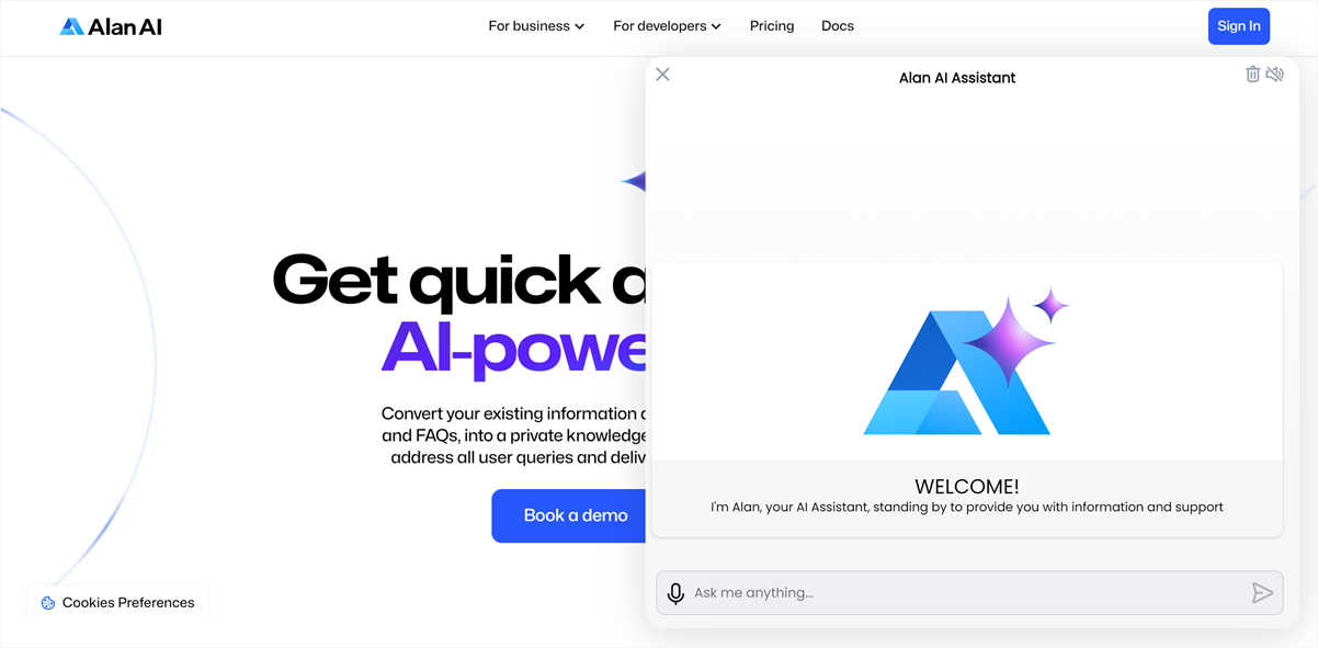
You can display a card using the showPopup() function.
In the example below, the Agentic Interface displays a greeting to the user when a new dialog session starts:
onCreateUser(p => {
const greetingImage = "https://storage.googleapis.com/alan-public-images/alan-webflow-website/alan-chat-logo.svg";
const greetingTitle = "WELCOME!";
const greetingText = "I'm Alan, your Agentic Interface, standing by to provide you with information and support";
const backgroundColor = "#f6f6f6";
const topBackgroundColor = "#fff";
const bottomHeight = "310px";
p.showPopup({
style:`.img {width: 240px;margin: 20px;}.info-popup {background: ${backgroundColor};max-width: 100%;height: ${bottomHeight};width: 100%;max-height: ${topBackgroundColor};box-shadow: 0px 1px 3px rgba(16, 39, 126, 0.2);overflow: hidden;border-radius: 10px;display: block;-webkit-box-orient: vertical;-webkit-box-direction: normal;-ms-flex-direction: column;flex-direction: column}.info-popup_header {background: ${topBackgroundColor};padding: 0px;display: block;color: #000;font-size: 22px;font-weight: 700;text-align: center;background: #fff;background-repeat: no-repeat;background-position: center center;background-size: 100% 100%}.info-popup_body {display: -webkit-box;display: -ms-flexbox;display: flex;-webkit-box-orient: vertical;-webkit-box-direction: normal;-ms-flex-direction: column;flex-direction: column;font-weight: 400;font-size: 23px;line-height: 48px;text-align: center;color: #000;padding: 9px 50px;height: 89px;}.info-popup_pointer-button {margin: 20px 20px;line-height: 20px;}`,
html: `<div class="info-popup"><div class="info-popup_header" style="font-size: 21px;"><img type="image/svg+xml" class="img" src="${greetingImage}" alt="image" /></div><div class="info-popup_body"><div class="info-popup_pointer-button grey-arrow">${greetingTitle}<br/><span style="font-size:14px; font-weight:400; display: contents;">${greetingText}</span></div></div></div>`,
overlay: true,
buttonMarginInPopup: 15,
force: false,
type: "chat",
});
});
Card display events
You can choose to display a card in the Agentic Interface on different events, for example:
When the dialog transitions between different states: the user starts a new dialog session, the visual state is set, a specific Alan AI event is fired and so on. For details, see Lifecycle callbacks.
When an intent is matched. For details, see User commands.
When a project API method is called. For details, see Project API.
In the example below, the Agentic Interface displays a greeting card to the user when a new dialog session starts and the onCreateUser() predefined callback is invoked:
onCreateUser(p => {
    const greetingImage = "https://storage.googleapis.com/alan-public-images/alan-webflow-website/alan-chat-logo.svg";
    const greetingTitle = "Hi, this is Alan, your Agentic Interface!";
    const greetingText = "You can talk to me, ask questions and perform tasks with text commands. For example, you can ask: \n - What pricing plans are available? \n - How do I contact Sales? \n - Where can I find Alan docs?";
    const image = `<img style="display: block;margin-bottom: 20px; height:75px" src="${greetingImage}"/>`;
    const title = `<div style="margin-bottom: 10px;font-weight: 700;font-size: 20px;">${greetingTitle}</div>`;
    p.play(`${image}${title}${greetingText}`, opts({ force: true, markdown: true, audio: false, greeting: true}));
});
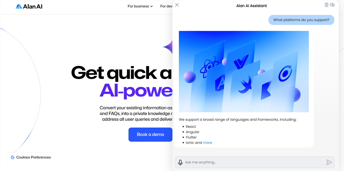
In the example below, the Agentic Interface displays a card to the user when the What platforms do you support? intent is matched:
intent('What platforms do you support?', p => {
    const cardImage = "https://assets-global.website-files.com/64ec3fc5bb945b48c0a37b1c/650a990518d70919bfea06c8_integrate_benefit2.webp";
    const cardText = "We support a broad range of languages and frameworks, including: \n\n - React \n\n - Angular \n\n - Flutter \n\n - Ionic and [more](https://alan.app/docs/client-api/integration/)";
    const image = `<img style="display: block;margin-bottom: 20px;" src="${cardImage}"/>`;
    p.play(`${image}${cardText}`, opts({ force: true, markdown: true, audio: false, greeting: true}));
});
In the example below, the Agentic Interface displays a greeting when the Alan AI agentic interface is authorized and the sendGreetingMessage() project API method is invoked in the app:
projectAPI.sendGreetingMessage = function(p, param, callback) {
    const greetingImage = "https://storage.googleapis.com/alan-public-images/alan-webflow-website/alan-chat-logo.svg";
    const greetingTitle = "Hi, this is Alan, your Agentic Interface!";
    const greetingText = "You can talk to me, ask questions and perform tasks with text commands. For example, you can ask: \n - What pricing plans are available? \n - How do I contact Sales? \n - Where can I find Alan docs?";
    const image = `<img style="display: block;margin-bottom: 20px; height:75px" src="${greetingImage}"/>`;
    const title = `<div style="margin-bottom: 10px;font-weight: 700;font-size: 20px;">${greetingTitle}</div>`;
    p.play(`${image}${title}${greetingText}`, opts({ force: true, markdown: true, audio: false, greeting: true}));
    callback();
};
<script>
  var alanBtnInstance = alanBtn({
    key: "YOUR_KEY_FROM_ALAN_STUDIO_HERE",
    onConnectionStatus: function (status) {
      if (status === 'authorized') {
        window.alanBtnInstance.callProjectApi("sendGreetingMessage");
      }
    },
    rootEl: document.getElementById("alan-btn"),
  });
</script>
Card parameters
The showPopup() function displaying cards in the Agentic Interface takes the following parameters:
Popup editor
Alan AI Studio comes with the popup editor – a tool that allows you to preview UI widgets, such as buttons, cards and Alan AI agentic interface popups, and edit their code in a convenient way.
To open a UI widget in the popup editor:
In the code editor, to the left of
showPopup(), click the edit icon.If you have several popups in the dialog script, in the left pane, select the widget you want to preview.
To prettify the code, at the top of the editor, click Format HTML, Format CSS and Format Params.
Edit the HTML, CSS code and update
paramsdata if needed.In the lower part of the editor, select the platform and device on which you want to preview the element. You can preview the element on a single device or choose to display all versions at once: browser, tablet and mobile.
To change the background, click the Device background color picker and choose the color.
To save the results, at the bottom of the left pane, click Save changes.
Note
To be rendered in the popup editor, the params object should only contain numbers, strings, Boolean values or arrays/objects constructed with these values. If your params object contains other types of values, the popup editor will fail to generate a real-time preview for your data.
You can edit the params data directly in the editor. Mind, however, that these changes will not be saved.