Alan AI Agentic Interface
The Alan AI Agentic Interface allows users to interact through UI using the following interaction modes:
Text
Text and voice
Note
At present, the Alan AI Agentic Interface is supported on the Web platform.
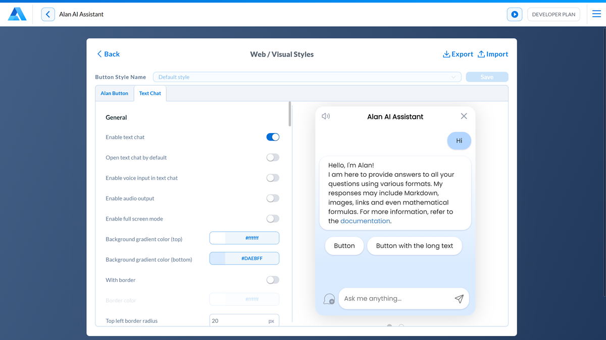
To enable the Alan AI Agentic Interface:
At the top of the code editor, click Integrations.
In the Integrations view, to the right of the Visual styles field, click Configure.
Click the Text Chat tab and make sure the Enable text chat option is turned on.
To customize the Agentic Interface behavior and look and feel, use general and UI settings for the Agentic Interface.
General Agentic Interface settings
To customize the Alan AI Agentic Interface behavior, use the following settings:
By default, the Alan AI Agentic Interface is displayed when the user clicks the Agentic Interface button in the app. To open the Agentic Interface window immediately when the Agentic Interface button is initialized in the app, enable the Open text Agentic Interface by default option.
To allow interactions through both text and voice, turn on the Enable voice input in text chat option.
To allow users to turn on and off audio output, turn on the Show audio output mode icon option. The Alan AI Agentic Interface will display the speaker icon in the top left corner of the Agentic Interface window, and users will be able to turn audio output off and on by clicking this icon.
To enable audio output by default, turn on the Enable audio output option.
To allow users to open the text Agentic Interface in the full screen mode, turn on the Enable full screen mode option.
To enable users to download a transcript of the Agentic Interface conversation, turn on the Enable saving the Agentic Interface history. The Alan AI Agentic Interface will display the download icon in the top right corner of the Agentic Interface window.
Agentic Interface UI settings
Alan AI provides advanced settings that allow you to personalize every aspect of the Alan AI Agentic Interface UI.
Agentic Interface window settings
To customize the Agentic Interface window, use the following settings:
Gradient type: choose the gradient style for the Agentic Interface window: Linear, Radial or Custom. If you choose the Custom option, in the field below, define a CSS rule for the gradient, for example:
linear-gradient(135deg, rgba(128, 0, 128, 0.9) 20%, rgba(0, 0, 255, 0.8) 80%);.Background gradient color (top, bottom, center, sides): choose colors of the gradient background.
With border and Border color: to display the border for the Agentic Interface window, enable this option, choose the border color and transparency level.
Top padding, Right padding, Bottom padding, Left padding: specify the padding value for the Agentic Interface window.
Top left border radius, Top right border radius, Bottom right border radius, Bottom left border radius: specify the border radius for the corners of the Agentic Interface window.
Text chat min. height: specify the minimum height in pixels for the Agentic Interface window. If the Agentic Interface content is less than the minimum height, the minimum height will be applied. The value must be between 160px and 1000px.
Text chat height: specify the height in pixels for the Agentic Interface window. The value must be between 400px and 1200px.
Text chat max. height: specify the maximum height in pixels for the Agentic Interface. This property prevents the Agentic Interface height from becoming larger than the specified height. The value must be between 600px and 5000px.
Text chat min. width: specify the minimum width in pixels for the Agentic Interface window. The value must be between 250px and 1000px.
Text chat width: specify the width in pixels for the Agentic Interface window. The value must be between 250px and 4000px.
Text chat max. width: specify the maximum width in pixels for the Agentic Interface window. This property prevents the Agentic Interface width from exceeding the specified width. The value must be between 250px and 4000px.
Font: in the field, start typing the font name and choose the necessary font from the list:
If you choose a Google font, you must add it to your website:
In the message below the font field, click the Copy icon to copy the font tag.
Add the copied tag to the
<head>section of the webpage:<link href="https://fonts.googleapis.com/css?family=Lato" rel="stylesheet">.
If you choose a custom font:
In the Font field, specify the font family and a fallback font, for example,
Clarity City, sans-serif.Download the font and make it available on your website. A common practice is to create a fonts folder.
Add the font to the
<head>section of the webpage using the@font-facerule in the CSS:Website¶<style> @font-face { font-family: 'CustomFont'; src: url('../fonts/CustomFont.eot'); /* IE9 Compat Modes */ src: url('../fonts/CustomFont.eot?#iefix') format('embedded-opentype'), /* IE6-IE8 */ url('../fonts/CustomFont.woff2') format('woff2'), /* Super Modern Browsers */ url('../fonts/CustomFont.woff') format('woff'), /* Modern Browsers */ url('../fonts/CustomFont.ttf') format('truetype'), /* Safari, Android, iOS */ url('../fonts/CustomFont.svg#CustomFont') format('svg'); /* Legacy iOS */ font-weight: normal; font-style: normal; } </style>
Note
By default, the Alan AI Agentic Interface uses the Poppins Google font. To display the Agentic Interface layout correctly, make sure you copy the font tag below and add to the <head> section of your website.
<link href="https://fonts.googleapis.com/css2?family=Poppins:ital,wght@0,100;0,200;0,300;0,400;0,500;0,600;0,700;0,800;0,900;1,100;1,200;1,300;1,400;1,500;1,600;1,700;1,800;1,900&display=swap" rel="stylesheet">
Agentic Interface header settings
To customize the Agentic Interface header, use the following settings:
Chat name: specify the name to be displayed at the top of the Agentic Interface.
Header icon: add a custom icon to the Agentic Interface header. The icon image must be in the SVG format and must fit within a rectangle of 24px by 24px or less.
Gap: set the space between the icon and text in the Agentic Interface header.
Vertical alignment: adjust the vertical alignment of the icon and text in the Agentic Interface header.
Layout: choose the position of the Agentic Interface title in the header: Title in the center or Title in the left.
Height: specify the header height. The value must be between 30px and 80px.
With gradient on bottom border: disable this option to remove a gradient effect to messages that extend beyond the scrolling area.
Font size: specify the font size for the Agentic Interface header. The value must be between 10px and 26px.
Top padding, Right padding, Bottom padding, Left padding: specify the padding value for the Agentic Interface header.
Font color: choose the font color for the Agentic Interface header.
Background color: choose the background color for the Agentic Interface header.
Close icon, Audio output icon, Audio output enabled icon, Audio output disabled icon, Full screen mode icon, Enter full screen mode icon, Exit full screen mode icon, Save the Agentic Interface history icon color: choose a custom icon, choose the icon color and transparency level for the Agentic Interface header. The icon image must be in the SVG format and must fit within a rectangle of 20px by 20px or less.
Request bubble settings
To customize the request bubble, use the following settings:
Font size: specify the font size for the request bubble. The value must be between 10px and 26px.
Font color: choose the font color for the request bubble.
Background color: choose the background color and transparency level for the request bubble.
Border color: choose the border color and transparency level for the request bubble.
With shadow: disable this option not to display shadow for the request bubble.
Top padding, Right padding, Bottom padding, Left padding: specify the padding value for the request bubble.
Top left order radius, Top right border radius, Bottom right border radius, Bottom left border radius: specify the border radius for the corners of the request bubble.
Request bubble label settings
To customize labels displayed above request bubbles, use the following settings:
With label: enable this option to display the label over the request bubble.
Label: specify the text of the request bubble label.
Font size: specify the font size for the request bubble label. The value must be between 10px and 22px.
Font color: choose the font color and transparency level for the request bubble label.
Top padding, Right padding, Bottom padding, Left padding: specify the padding value for the request bubble label.
Response bubble settings
To customize the response bubble, use the following settings:
Font size: specify the font size for the response bubble. The value must be between 10px and 26px.
Font color: choose the font color for the response bubble.
Background color: choose the background color and transparency level for the response bubble.
Border color: choose the border color and transparency level for the response bubble.
With shadow: disable this option not to display shadow for the response bubble.
Top padding, Right padding, Bottom padding, Left padding: specify the padding value for the response bubble.
Top left order radius, Top right border radius, Bottom right border radius, Bottom left border radius: specify the border radius for the corners of the response bubble.
Add copy button for response bubbles: enable this option to display the copy button in response bubbles and allow the user to copy Agentic Interface responses.
Add like button for response bubbles: enable this option to display the like button in response bubbles and allow the user to express their approval of Agentic Interface responses. For details, see Likes and dislikes feedback setup.
Copy, Like, Dislike buttons color: choose the color and transparency level for like and dislike buttons.
Links in text
To customize links displayed in the text of Agentic Interface responses, use the following settings:
Link color: choose the color and transparency level for links.
Learn more links
To customize links displayed below Agentic Interface responses, use the following settings:
Top left border radius, Top right border radius, Bottom right border radius, Bottom left border radius: specify the border radius for the corners of the links box.
Border color: choose the border color and transparency level for the link box.
Text part background color: choose the background color for the text area in link boxes.
Number part background color: choose the background color for the number area in link boxes.
Code
To customize code snippets displayed in Agentic Interface responses, use the following settings:
Background color: choose the background color and transparency level for code snippets.
Border color: choose the border color and transparency level for code snippets.
Theme: choose the theme for code snippets in response bubbles: Light or Dark.
Table
To customize tables displayed in Agentic Interface responses, use the following settings:
Border color: choose the border color and transparency level for tables.
Response bubble label settings
To customize labels displayed above response bubbles, use the following settings:
With label: enable this option to display the label over the response bubble.
Label: specify the text of the response bubble label.
Icon: add a custom icon to the label. The icon image must be in the SVG format and must fit within a rectangle of 24px by 24px or less.
Gap: set the space between the icon and text in the label.
Vertical alignment: adjust the vertical alignment of the icon and text in the label.
Font size: specify the font size for the response bubble label. The value must be between 10px and 22px.
Font color: choose the font color and transparency level for the response bubble label.
Top padding, Right padding, Bottom padding, Left padding: specify the padding value for the response bubble label.
Response waiting bubble
To customize the response waiting bubble displayed while an Agentic Interface response is being generated, use the following settings:
Layout: choose the layout style for the response waiting bubble: Default, Loader+label, Loader+label without bubble.
Label: specify the text for the response waiting bubble.
Loader icon: choose a custom icon for the response waiting bubble.
Gap: set the space between the icon and text in the response waiting bubble.
Vertical alignment: adjust the vertical alignment of the icon and text in the response waiting bubble.
Buttons
To customize buttons displayed in the Agentic Interface, use the following settings:
Font size: specify the font size for Agentic Interface buttons. The value must be between 10px and 22px.
Top padding, Right padding, Bottom padding, Left padding: specify the padding value for Agentic Interface buttons.
Top left order radius, Top right border radius, Bottom right border radius, Bottom left border radius: specify the border radius for the corners of Agentic Interface buttons.
Font color: choose the font color for Agentic Interface buttons.
Background color: choose the background color for Agentic Interface buttons.
Border color: choose the border color for Agentic Interface buttons.
With shadow: disable this option not to show shadow for Agentic Interface buttons.
Text alignment: choose how the button label should be aligned: Center, Left or Right.
Buttons alignment and Button alignment in full screen mode: choose how Agentic Interface buttons must be aligned in the compact and full screen modes: Center, Left or Right.
Gap: set the space between buttons in the Agentic Interface window.
Agentic Interface input settings
To customize the Agentic Interface input box, use the following settings:
Placeholder: specify the placeholder text to be displayed in the Agentic Interface input box.
Type: enable this option to allow users to enter multiple lines of text in the Agentic Interface input field.
Max. lines count: specify the maximum number of lines in the Agentic Interface input field before a scrollbar appears.
Font size: specify the font size for the Agentic Interface input box. The value must be between 10px and 26px.
Font color: choose the font color and transparency level for the Agentic Interface input box.
Placeholder font color: choose the font color and transparency level for the placeholder text. These settings are also applied to the Send button in the inactive state.
Background color: choose the background color for the Agentic Interface input box.
Border color: choose the border color for the Agentic Interface input box.
With shadow: disable this option not to display shadow for the Agentic Interface input box.
Microphone icon: choose a custom icon for the Microphone button. The icon image must be in the SVG format and must fit within a rectangle of 46px by 46px or less.
Send and mic. icons color: choose the icon color for the Agentic Interface input box.
Top padding, Right padding, Bottom padding, Left padding: specify the padding value for the Agentic Interface input box.
Top left order radius, Top right border radius, Bottom right border radius, Bottom left border radius: specify the border radius for the corners of the Agentic Interface input box.
Notification bubble settings
To customize bubble displayed on top of the Agentic Interface button, use the following settings:
Font color: specify the font size for the notification bubble. The value must be between 10px and 26px.
Background color: choose the background color for the notification bubble.
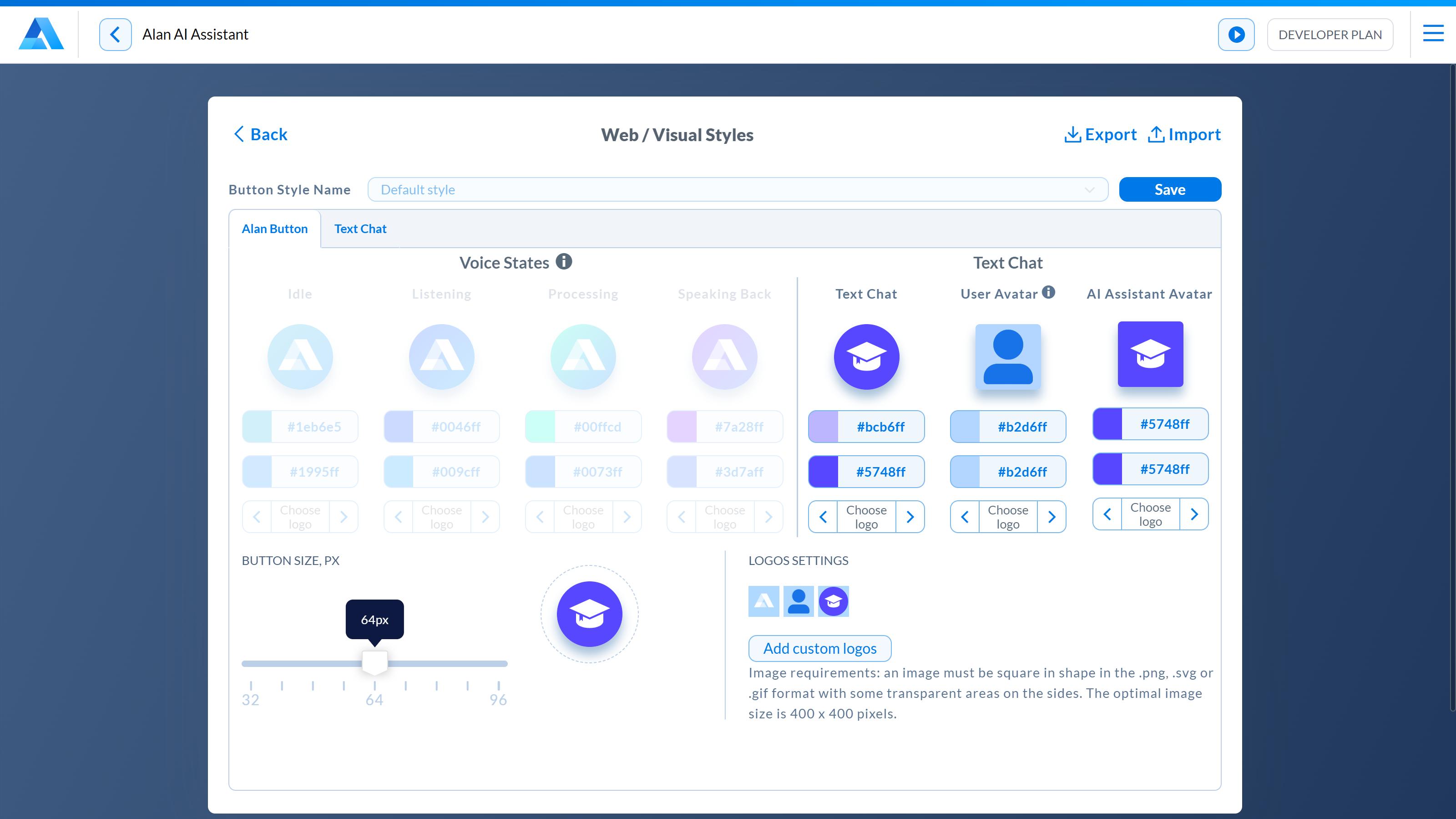
Agentic Interface button settings
By default, the Agentic Interface button is blue. You can customize colors and logo for the Alan AI Agentic Interface button.
At the top of the code editor, click Integrations.
In the Integrations view, to the right of the Visual styles field, click Configure.
On the Alan Button tab, choose the necessary colors for Agentic Interface button states:
Text Chat State: the icon for the text Agentic Interface button
Text Chat Avatar State: the icon for the Agentic Interface in the full screen mode of the Alan AI Agentic Interface
In the Logos settings section, click Add custom logos and choose one or more image files.
Use the right and left controls below each button state to assign the image to this state.
In the Button Size section, drag the slider right or left to make the button larger or smaller.
To save the configured color scheme, in the Integrations view, to the right of the Button Code field, click Save and define the scheme name. You can switch between the default color scheme and saved color schemes at any time.
Settings export and import
You can easily transfer the Agentic Interface settings between projects on your Alan AI Studio account.
To export the Agentic Interface settings:
At the top of the code editor, click Integrations.
In the Integrations view, to the right of the Visual styles field, click Configure.
At the top of the Visual styles view, click Export.
Alan AI will save the Agentic Interface settings as a JSON file in the default downloads folder on your computer.
To import the Agentic Interface settings:
At the top of the code editor, click Integrations.
In the Integrations view, to the right of the Visual styles field, click Configure.
At the top of the Visual styles view, click Import and choose a previously saved JSON file with Agentic Interface settings.
To the right of Button style names, click Save to save the imported settings.