Chat buttons
To enhance and streamline the user experience, you can display buttons in the Alan AI Chat.
Buttons are clickable elements that present users with a list of options or actions they can take. When the user clicks a button, the AI assistant responds back or triggers some logic defined in the dialog script.
Buttons can be used for a variety of purposes, including:
Presenting a menu of options
Initiating specific tasks or actions
Providing quick access to commonly used features
Confirming or denying users’ actions
Submitting requests and more
Buttons setup
To display buttons in the chat UI, use the showButtons() function in the script.
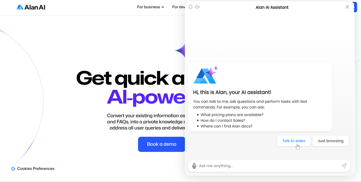
In the example below, when a new dialog session starts, the AI assistant displays a greeting with two buttons: Talk to sales and Just browsing:
onCreateUser(p => {
    // Chat greeting
    const greetingImage = "https://storage.googleapis.com/alan-public-images/alan-webflow-website/alan-chat-logo.svg";
    const greetingTitle = "Hi, this is Alan, your AI assistant!";
    const greetingText = "You can talk to me, ask questions and perform tasks with text commands. For example, you can ask: \n - What pricing plans are available? \n - How do I contact Sales? \n - Where can I find Alan docs?";
    const image = `<img style="display: block;margin-bottom: 20px; height:75px" src="${greetingImage}"/>`;
    const title = `<div style="margin-bottom: 10px;font-weight: 700;font-size: 20px;">${greetingTitle}</div>`;
    p.play(`${image}${title}${greetingText}`, opts({ force: true, markdown: true, audio: false, greeting: true}));

    // Chat buttons
    p.showButtons({
        buttons:[
            {label:'Talk to sales'},
            {label:'Just browsing'},
        ],
        force: true
    });
});

intent("Talk to sales", p => {
    p.play("Awesome, I just need to confirm some information first...");
});

intent("Just browsing", p => {
    p.play("What would you like me to do?");
});
Button parameters
The showButtons() function takes the following parameters:
Name |
Type |
Description |
|---|---|---|
|
Array |
Contains a list of buttons to be displayed in the chat. For each button in the list, the following parameters must be defined:
|
|
Boolean |
If |
Button actions
When a button is clicked, the AI assistant can perform one of the following actions:
Intents
On button click, you can invoke an intent in the dialog script. To do this, you can do either of the following:
Define only the
labelparameter for the button. In this case, the label text must match the pattern of the intent you want to invoke.Define the
labelandsendTextparameters for the button. In this case, the label text can vary, and the text of thesendTextparameter must match the pattern of the intent you want to invoke.
In the example below, when the Talk to sales and Just browsing buttons are clicked, corresponding intents are invoked in the dialog script. Note that the label for the second button differs from the pattern of the intent to be invoked:
onCreateUser(p => {
    // Chat greeting
    const greetingImage = "https://storage.googleapis.com/alan-public-images/alan-webflow-website/alan-chat-logo.svg";
    const greetingTitle = "Hi, this is Alan, your AI assistant!";
    const greetingText = "You can talk to me, ask questions and perform tasks with text commands. For example, you can ask: \n - What pricing plans are available? \n - How do I contact Sales? \n - Where can I find Alan docs?";
    const image = `<img style="display: block;margin-bottom: 20px; height:75px" src="${greetingImage}"/>`;
    const title = `<div style="margin-bottom: 10px;font-weight: 700;font-size: 20px;">${greetingTitle}</div>`;
    p.play(`${image}${title}${greetingText}`, opts({ force: true, markdown: true, audio: false, greeting: true}));

    // Chat buttons
    p.showButtons({
        buttons:[
            {label:'Talk to sales'},
            {label:'Just browsing', sendText: "I am just browsing"},
        ],
        force: true
    });
});

intent("Talk to sales", p => {
    p.play("Awesome, I just need to confirm some information first...");
});

intent("I am just browsing", p => {
    p.play("What would you like me to do?");
});
Visual state
On button click, you can set the visual state in the dialog. To do this, you must add the setVusialState parameter to the button and define the visual state data.
In the example below, when the Go to docs button is clicked, the visual state is set to docs and the AI assistant plays a message: Welcome to Alan AI docs!:
onCreateUser(p => {
    // Chat greeting
    const greetingImage = "https://storage.googleapis.com/alan-public-images/alan-webflow-website/alan-chat-logo.svg";
    const greetingTitle = "Hi, this is Alan, your AI assistant!";
    const greetingText = "You can talk to me, ask questions and perform tasks with text commands. For example, you can ask: \n - What pricing plans are available? \n - How do I contact Sales? \n - Where can I find Alan docs?";
    const image = `<img style="display: block;margin-bottom: 20px; height:75px" src="${greetingImage}"/>`;
    const title = `<div style="margin-bottom: 10px;font-weight: 700;font-size: 20px;">${greetingTitle}</div>`;
    p.play(`${image}${title}${greetingText}`, opts({ force: true, markdown: true, audio: false, greeting: true}));

    // Chat buttons
    p.showButtons({
        buttons:[
            {label:'Talk to sales'},
            {label:'Go to docs', setVisualState: {page: "docs"}}
        ],
        force: true
    });
});

intent("Talk to sales", p => {
    p.play("Awesome, I just need to confirm some information first...");
});

onVisualState((p, s) => {
    console.log(JSON.stringify(s));
    if (s.page === "docs") {
        p.play("Welcome to Alan AI docs!")
    }
});
Project API
On button click, you can call a project API method in the dialog script. To do this, you must add the callProjectApi parameter to the button, define the method name and data you want to pass to the project API method.
In the example below, when the Contact support button is clicked, the contactSupport() project API method is called and the user’s name is passed to the method:
onCreateUser(p => {
    // Chat greeting
    const greetingImage = "https://storage.googleapis.com/alan-public-images/alan-webflow-website/alan-chat-logo.svg";
    const greetingTitle = "Hi, this is Alan, your AI assistant!";
    const greetingText = "You can talk to me, ask questions and perform tasks with text commands. For example, you can ask: \n - What pricing plans are available? \n - How do I contact Sales? \n - Where can I find Alan docs?";
    const image = `<img style="display: block;margin-bottom: 20px; height:75px" src="${greetingImage}"/>`;
    const title = `<div style="margin-bottom: 10px;font-weight: 700;font-size: 20px;">${greetingTitle}</div>`;
    p.play(`${image}${title}${greetingText}`, opts({ force: true, markdown: true, audio: false, greeting: true}));

    // Chat buttons
    p.showButtons({
        buttons:[
            {label:'Talk to sales'},
            {label:'Contact support', callProjectApi: {method:'contactSupport', data:{name:'John Smith'}}}
        ],
        force: true
    });
});

intent("Talk to sales", p => {
    p.play("Awesome, I just need to confirm some information first...");
});

projectAPI.contactSupport = function(p, param, callback) {
    p.userData.name = param.name
    p.play(`Thank you, ${p.userData.name}. Please provide a detailed description of the problem you have encountered...`);
    callback();
};
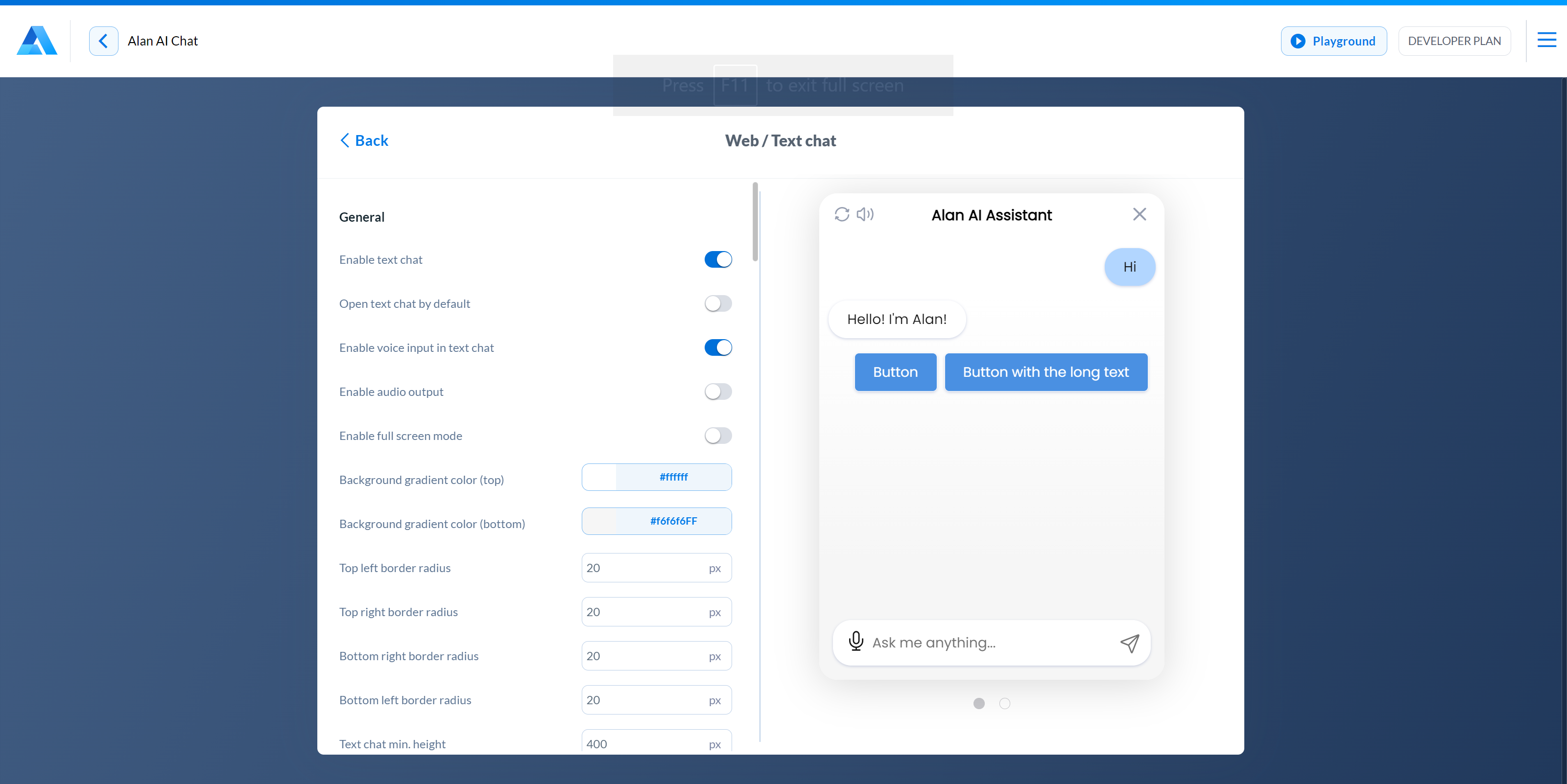
Button design
The design of buttons displayed in the chat is defined at the project level. To change the buttons look:
At the top of the code editor, click Integrations.
Next to the Text chat option, click Change.
In the Web/Text chat view, scroll down to the Buttons section and adjust the buttons look as required. You can change the following settings:
Font size: specify the font size for chat buttons. The value must be between 10px and 22px.
Top left order radius, Top right border radius, Bottom right border radius, Bottom left border radius: set the border radius for the corners of chat buttons.
Font color: choose the font color for chat buttons.
Background color: choose the background color for chat buttons.
Border color: choose the border color for chat buttons.
With shadow: disable this option not to show shadow for chat buttons.
Buttons alignment and Button alignment in full screen mode: choose how chat buttons must be aligned in the compact and full screen modes: on the left, in the center or on the right.